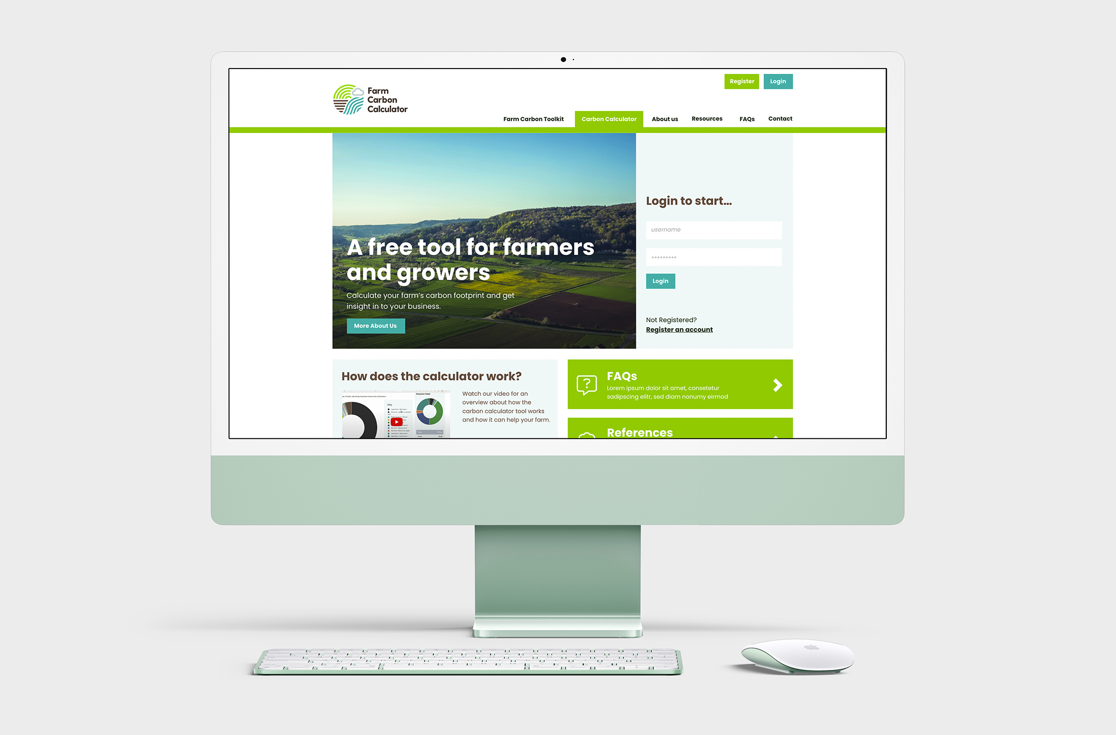
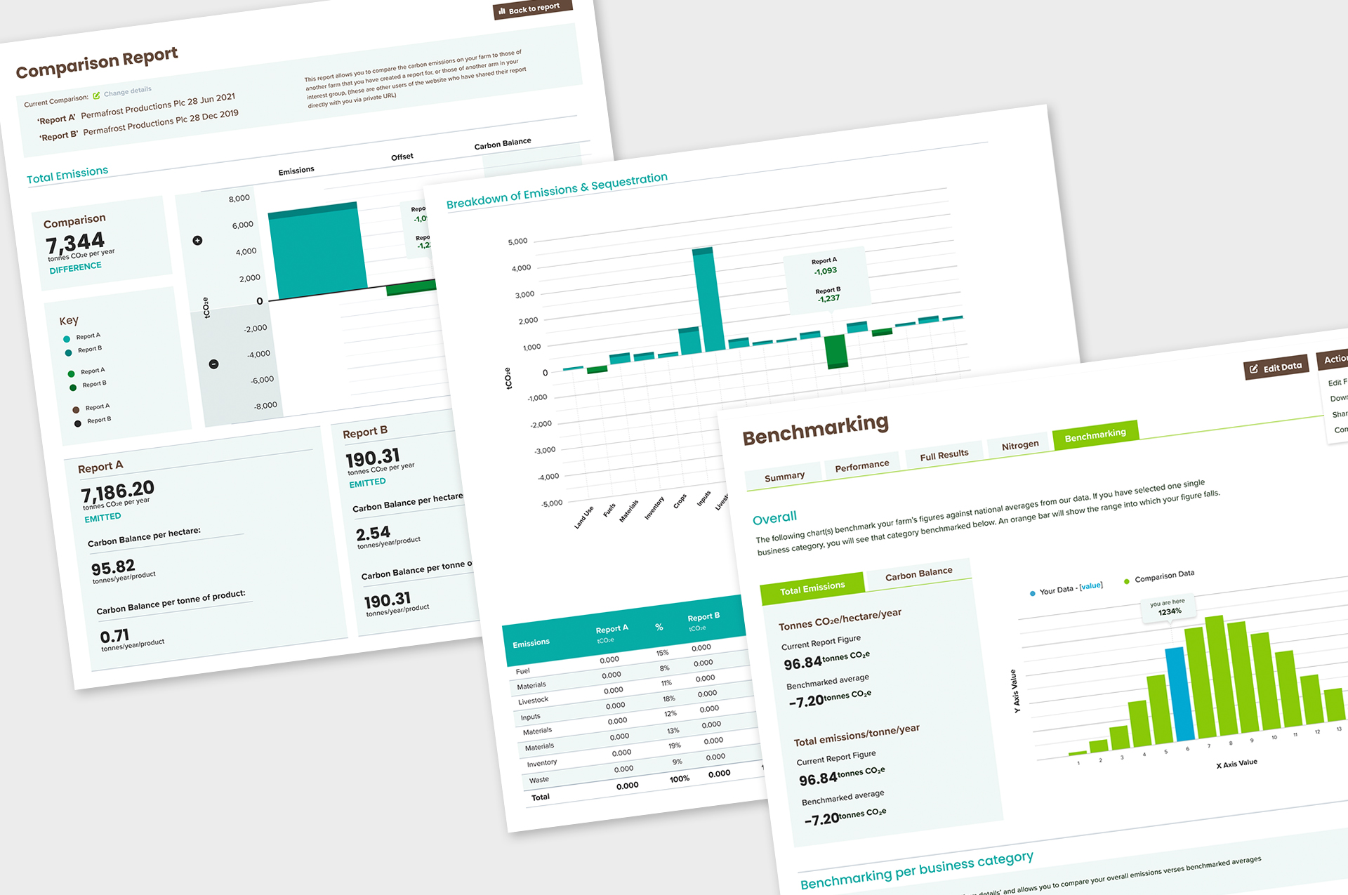
Farm Carbon Calculator, along with its sister site, Farm Carbon Toolkit are free tools provided for UK farmers to enable them to track, document and report their emissions to suppliers and relevant authorities. The calculator is a complex diagnostic system, capable of calculating and benchmarking emissions from a multitude of sources including fuel, livestock and crops. I was tasked with cleaning up and modernising the user interface and charting systems, ensuring the report creation process was intuitive and flexible enough to cater for the varied needs of each farm. There were also significant UX and accessibility issues that needed remedying including responsive optimisation and user onboarding improvements.
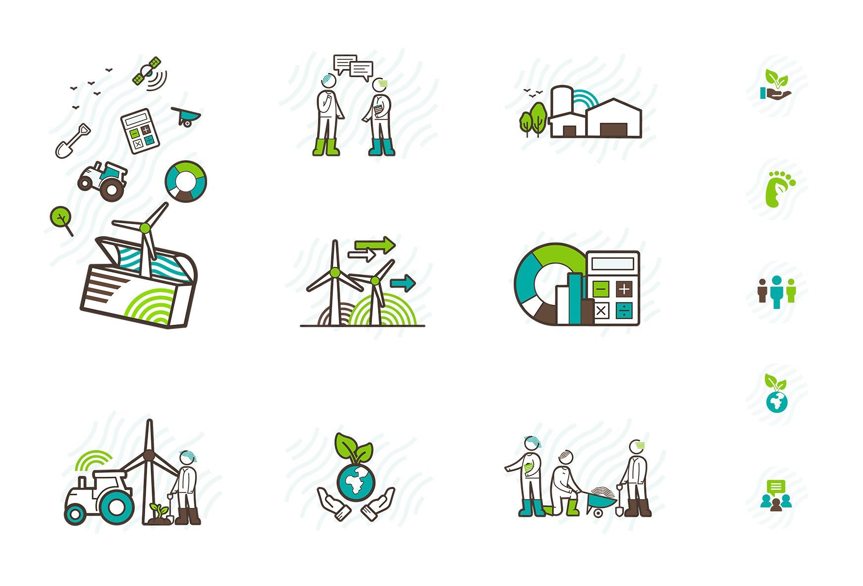
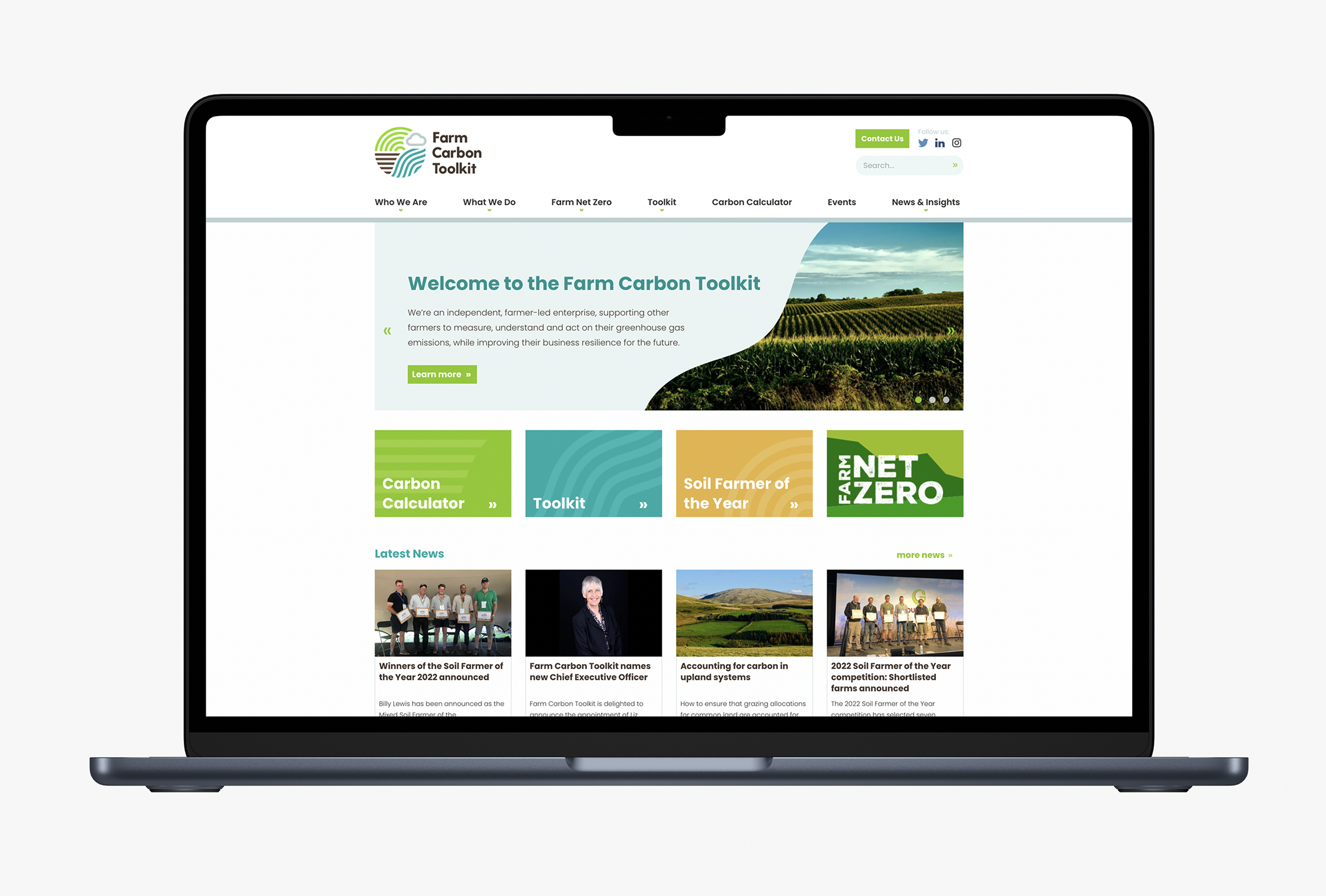
Alongside UX and UI, I advised on the creation of a new identity, and created a complementary set of illustrations and iconography to use across the sites and printed materials. In Addition to the main FCC and FCT brands, I worked on several sub-brands for individual and seasonal campaigns, including Farm Net Zero, a huge project in Cornwall organised by the Cornish agricultural community working towards government Net Zero targets.